Wisely
Card Order Status
In this project, I designed a solution to optimize Wisely’s call center and reduce call volume by allowing users to track their card order, giving users more control and agency.
A step closer to financial agency and transparency
Wisely is an online banking solution which gives users 100% digital pay including other benefits like early pay and cashback rewards that is streamlined and managed through the myWisely app. The overall project aims to reduce Wisely’s call center volume by designing self-service solution for users if they need to replace their card. In addition, users can check the status of their card order after they placed an order for a new card.
Impact of new solution
Total number of lifetime visitors
773,412
mobile users
16,655
desktop users
Call center volume
80%
drop in the number of service calls
The problem: A common question that drives up call center costs
“Where is my card and when will it come?”
Users had no way to track their card order status within the myWisely app, forcing them to call the support center for updates. This created a frustrating and inefficient experience, while also driving up operational costs for the business.
Design challenges along the way
Productive collaboration
Bridging user needs and business objectives by working cross-functionally with product and development teams.
Ownership as a designer
Taking ownership of this project as a junior designer was a new experience for me, and it challenged me to learn and grow throughout the process.
Working with an emerging design system
New components were being developed alongside this flow, so ensuring my designs stayed aligned with the latest components was an ongoing challenge.
What solutions are currently out there?
Because card order status is a pretty nuanced and specific feature, I researched and examined how different products conveyed status and progress through design and information architecture. I looked at various UI components like progress trackers and card tiles.
Designing for our users: meet Sam

Sam
the Wisely member
Wisely is the only card I use to pay all my bills.
- Age
- 43
- Education
- High School
- Status
- Married
- Occupation
- Clerk
- Location
- Charleston, SC
Brief story
Sam is an archetype we have created at Wisely to understand and empathize with our users. They are financially insecure and often live paycheck to paycheck. They use the Wisely card for all their payments.
Characteristics
- Experience with Wisely Pay is shaped by their employer’s involvement
- Uses the same money apps as their social circle
- Manages their money with whoever is most convenient
- Aspires to save and attain financial stability
Frustrations
- Can’t bear paying unjust fees
- Can’t afford a financial setback
- Due dates and making payments
Mapping the user journey
The card order status feature can be accessed from multiple different touchpoints and user flows. It exists within a larger ecosystem of replacement card self service. In addition to being accessible from the homepage, users can also view the status of their order after they place an order for a new card.
- Launch myWisely app
- Log in and navigate to dashboard
- Click on order status tile
- View additional tracking info
They asked, we listened: how user feedback shaped the final solution
As I started doing UX reviews with my development partners, I noticed changes could be made to the design that would significantly enhance the user experience. The design needed to be more proactive, anticipating potential blockages and making sure users are supported throughout the process.
The information architecture of the homepage is inconsistent. Multiple CTAs. The “activate now” button and the “view card order status” link are far apart.
FixHave only one primary call to action button and use logic to change the action of the button based on card status.
For some vendors like USPS, our system cannot keep track of the card after the card is shipped. As a result, we don’t know when the user will receive their card.
FixUse conditions and logic to help users advance through the flow based on the card status
Design advocacy in action
I experienced push back from my product manager when I asked for these changes because we were under pressure to deliver within a deadline. However, I believe that these changes are necessary and would significantly benefit the user experience, giving users greater clarity and control. I advocated the need for these changes by facilitating meetings with product and development to discuss the value of UX reviews.
Additionally, I had to navigate collaboration with a new scrum team that was still adjusting to our UX review process:
There were definitely some rough patches during this phase, but at the end, I felt that my team collaborated much more smoothly and efficiently. After all, the success of a product is dependent on the alignment of all product teams.
Our UX review process
Groom tickets
Review and groom tickets with product and development team
Design
Create the user flow and design the solution
Hand off
Create a "Handoff" page in Figma for developers to use as a reference. Include specs and accessibility guidelines
UX review
Review and groom tickets with product and development team
QA
Approved screens go through QA and if a UI discrepancy is found, a UX review must be conducted again
Summing it up: the final experience
Homepage
The experience on the homepage is dynamic and contextual. The buttons would change according to the status of the card. The homepage and card order status flows behave parallel to another.
Card order status
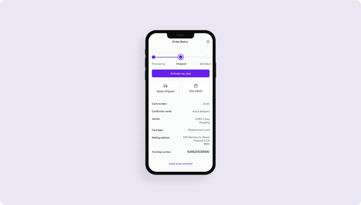
The card order status page provides detailed updates about the status of the card. It predicts any potential blockers users may have during card delivery and also identifies opportunities to complete onboarding.
Takeaways
This project helped me collaborate more effectively with my development and product team and also allowed me to articulate and advocate for my design decisions. From this experience, I not only designed a better product with more clarity and context for our users, I also worked with development and product to create a better process for UX reviews and scrum planning.