ADP
Scaling Accessible Native Mobile Design at ADP
During ADP’s eight-month Accessibility Cohort, I noticed we had almost no accessibility guidance for native mobile, so I built a guidebook to fill the gap.
- Newmobile-specific accessibility guidance where little existed
- 4mobile accessibility personas
- 7annotation patterns for native mobile
The problem
How do you design accessible experiences for a platform that has almost no mobile accessibility standards?
ADP had solid accessibility guidance for web, but very little for native mobile. The more I dug into assistive technology, the clearer it got that mobile isn’t just a smaller desktop. People swipe instead of clicking, tap instead of pointing precisely, squint at small screens, and use their phones while doing three other things.
Accessibility also isn’t an edge case. It’s someone carrying groceries, reading in bright sunlight, holding a child, or recovering from an injury.
Designing for real people
I created personas with permanent, temporary and situational disabilities. I wanted every recommendation to connect back to a real person in a real moment, not just a rule in a spec.
- JordanLow vision, uses VoiceOver
- TrishDeafblind, uses a Braille display
- MorganCerebral palsy, uses alternative input
- JamieDyslexia, finds reading hard
What I built
I looked at existing mobile toolkits and talked with developers about what they needed from annotations. That led to two resources any designer can pick up on a native mobile project.
A mobile accessibility checklist
It’s organized around WCAG’s four principles, so instead of memorizing dozens of rules, designers can run through it as part of a normal design review.
Native mobile annotations
ADP’s annotation toolkit is how designers and developers talk about accessibility in a design. I expanded it to cover the things mobile handles differently, including orientation, for people who can’t rotate a device that’s mounted to their wheelchair.
Titles
Mobile titles change with context and are a person’s main cue to where they are.
Headings
iOS treats headings as landmarks to jump between, not a strict H1–H6 outline.
Focus order
Cards, overlays and bottom sheets can easily scramble the reading order, so the annotation spells out what gets read, skipped and activated.
Labels
For every control, we note what’s visible, what a screen reader announces, and whether the two match.
State changes
Toggles, expanders, tabs and loading states should be announced, not just shown.
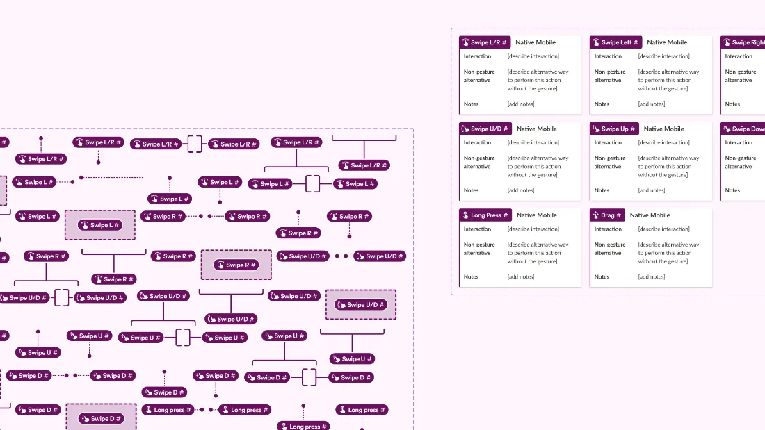
Gestures
Every swipe, long press or drag needs another way to do the same thing, and the annotation spells it out.
Impact
- Established mobile-specific accessibility guidance where none existed
- Expanded ADP’s annotation toolkit to native mobile interactions
- Reduced ambiguity in design-to-engineering handoff
- Encouraged accessibility conversations earlier in the design process
What’s next: this is still a work in progress. Right now I’m working with a lead UX designer to build out the native mobile annotation kit even further.
Watch my cohort showcase presentationVideo on YouTube (opens in a new tab)Reflection
Accessibility isn’t something you check right before launch, cross your fingers, and hope for the best. You design for it from the start. Some of my most meaningful work hasn’t been shipping another feature, but spotting a gap and building something that helps every designer make better products.